BLOG
Does Orientation Matter?
The orientation and proportions of a rendering's format should be whatever is required to support your composition and the form you plan to present.
If you settle on a horizontal format, the issue is not just how wide, but how tall in proportion to the width. Likewise with vertical. What mood or experience are you trying to convey to the viewer? Different formats inspire different feelings. A horizontal rendering is usually calming, expansive and restful; a vertical may be more dramatic or inspiring. Though some artists regard square format as static, I consider them simply neutral.
Did you enjoy this blog post? If so, then why not:
Leave Comment | Subscribe To This Blog | Email Me
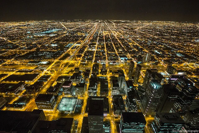
Cityscape Chicago: A Timelapse of Chicago in 30,000 Photographs by Eric Hines

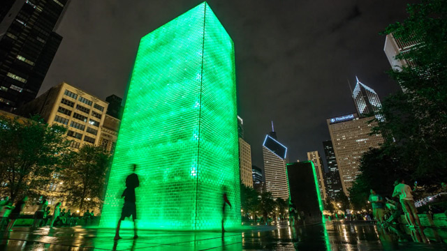

Filmmaker Eric Hines does a phenomenal job of making us look good here in the windy city with his most recent timelapse, Cityscape Chicago. The clip consists of over 30,000 still photographs taken between July and October of this year primarily around the bustling downtown areas including the financial district, Navy pier, Wacker drive and the lakefront.
Did you enjoy this blog post? If so, then why not:
Leave Comment | Subscribe To This Blog | Email Me
Pay Your Dues and be Patient
“Pay your dues and be patient. Very rarely does one come right out of art school and land their dream job. And I find that a lot of young creatives want that right away. If you stay true to your passion, eventually you’ll get to where you want to be.””
Did you enjoy this blog post? If so, then why not:
Leave Comment | Subscribe To This Blog | Email Me
Contrast and Emphasis
Contrast is emphasis. The sharpest contrast should be where you want the eye to go first. Contrast comes in many forms, including value, color, detail and line.
Value Contrast
The most important element is the value; the most influential of the principles is contrast. Put them together and you have a kind of contrast that packs the most punch.
Color Contrast
This usually refers to contrast in hue or temperature, but intensity also can play a role. A power struggle ensues when hues are equally intense. One must dominate, or the eye won't know where to look.
Contrast in Complexity
Just as brightness is enhanced by neutrality, detail, texture and pattern are more exciting next to areas of simplicity.
Contrast in Line
A rendering with entirely horizontal lines is effectively no rendering at all. When even a minimum of diagonal and vertical lines is added, the improvement is dramatic.

Did you enjoy this blog post? If so, then why not:
Leave Comment | Subscribe To This Blog | Email Me
Happy Birthday, Bob Ross
Robert Norman "Bob" Ross was an American painter, art instructor, and television host. He is best known as the creator and host of The Joy of Painting, a television program that ran for more than a decade on PBS in the United States and Canada.

Did you enjoy this blog post? If so, then why not:
Leave Comment | Subscribe To This Blog | Email Me
Many 3D Artists Feel Intimidated by Design
Architectural illustrations and 3D renderings are the same thing as composition. Despite rumours to the contrary, there's no imperative difference. They both boil down to what you put where. We make decisions then we place 3D geometry in one place or another on our screen.
Composition and design are ultimately what an architectural illustration and 3D rendering is about. Many 3D artists feel intimidated by design, that it's more than they want to deal with. They push it into the back-burner and hope that somehow it will take care of itself. However, the fact is that design can be demystified - and it must be, since consistently successful results come no other way.
Mountain climbing seems to mirror the act of creating 3D art. Does anyone just forgo planning and "hit the road" to reach the peak? Obviously, not if you intent to see the view from the top, and not if you plan to get there again. Happy accidents seldom happen when climbing to great heights. That requires understanding, planning and practice.
Even with a plan, success is never guaranteed. It just improves the chances. Good composition requires a well-developed sense of design. How do you require good design? You study, observe, and ask questions. In the process, you learn to see critically. And you render - a lot, while consciously applying the concepts you've discovered.
We're all aware that there's much about art that is intuitive. But few realise how much of art is logical and reasonable. It can be understood. And, once understood and absorbed, eventually it becomes second nature. Anyone who sets out with serious intent can master design.

Did you enjoy this blog post? If so, then why not:
Leave Comment | Subscribe To This Blog | Email Me
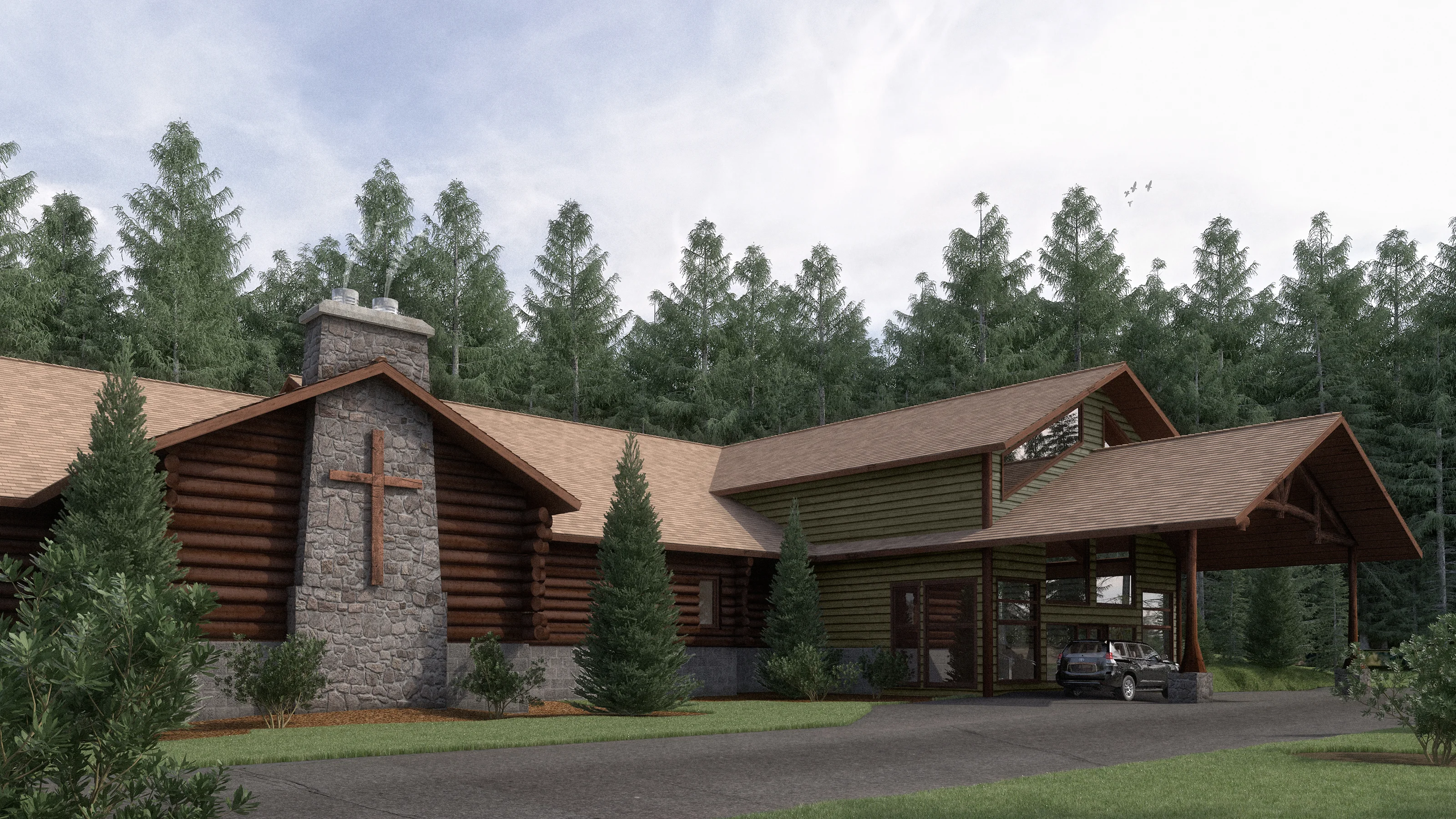
Crosslake Evangelical Free Church Rendering
Crosslake Evangelical Free Church in Crosslake, MN, also known as the Log Church, is proposing an addition to their historic church building. I was asked to illustrate the addition, attached to the existing log church, for fundraising.
Did you enjoy this blog post? If so, then why not:
Leave Comment | Subscribe To This Blog | Email Me
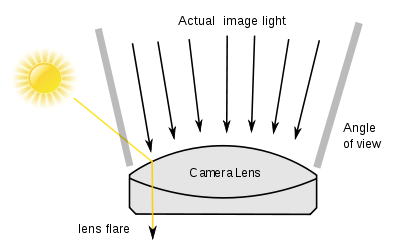
A Rendering with Flare
Flare adds atmosphere of a kind, and also a sense of actuality. Certainly, for strongly manipulated and special-effects imagery, adding flare can be a useful way of helping to convince the viewer that a scene is genuine.
The polygonal flare patterns that are created by internal aperture reflections and refractions from a point source of light (such as the sun) that is either just inside or just outside the picture frame.
From your final 3D rendering, inside your post processing application, you can add your flare. For the most part, you add a flare for a treatment that conveys the intensity of the sun and a general feeling of heat. The software I use is the Knoll Light Factory plug-in for Photoshop.
Keeping the generated flare on a separate layer makes it easy to align with the sun and the rest of your 3D scene.
Did you enjoy this blog post? If so, then why not:
Leave Comment | Subscribe To This Blog | Email Me
The Properties of Color
Any color has three basic properties - it's hue, its tone, and its intensity. Hue means the color as identified by its name - red or blue, for example. Tone means the lightness or darkness of a color. You can, for instance, have a light blue or a dark blue. In addition to the properties of hue and tone, colors have a varying degree of intensity. Two reds may be identical in tone and yet be clearly different, with one more intense, or brighter, than the other. The difference in intensity is sometimes called color saturation.
When you use the word color, you are generally referring to these three properties - hue, tone, and intensity - simultaneously. However, it is helpful to be able to identify them separately because when you notice that a color is "wrong", you will be better able to pinpoint what is wrong with it - whether it is too light in tone or too intense.

Did you enjoy this blog post? If so, then why not:
Leave Comment | Subscribe To This Blog | Email Me

Quick Thumbnail Sketches
To avoid basic mistakes in your composition, make a quick sketch of the main shapes.
It may sound laborious to make small sketches before embarking on the main 3D Architectural Rendering, but it is helpful, because it can save you having to make changes later. The more preparation you do, the more chance you have of achieving a successful 3D Architectural Rendering.


John Maeda: How art, technology and design inform creative leaders
John Maeda, President of the Rhode Island School of Design, delivers a funny and charming talk that spans a lifetime of work in art, design and technology, concluding with a picture of creative leadership in the future. Watch for demos of Maeda’s earliest work -- and even a computer made of people.
John Maeda is the president of the Rhode Island School of Design, where he is dedicated to linking design and technology. Through the software tools, web pages and books he creates, he spreads his philosophy of elegant simplicity.

Softness and Building Blur
Bryan O'Neil Hughes explains the importance of softness and shallow depth of field in photographs and how it is possible to mimic it in Photoshop CS6.

All Children are Artists
“All children are artists. The problem is how to remain an artist once he grows up.”
Making a Composite
A composite is a collection of photos, sketches, or ideas that you use to create one piece of art. Using certain elements from each image and then applying the rules of composition, you can create a successful composition.
By using this process, the artist has endless opportunities to create the perfect composition. Grab your camera and sketch pad and begin making some composites of your own.

Color Complements
Complimentary colors always appear opposite each other on the color wheel. Use complements to create color balance in your 3D Architectural Rendering. It takes practice to understand how to use compliments, but a good rule of thumb is to use the complement - or form of the complement of the predominant color in your 3D Architectural Rendering to highlight, accent or gray that color.
For example, if your 3D Architectural Rendering has a lot of green, use its complement, red - or a form of red such as orange or red-orange - for highlights. If you have a lot of blue in your 3D Architectural Rendering , use blue's complement, orange - or a form of orange such as yellow-orange or red-orange. The complement of yellow is purple or a form of purple. Keep a color wheel handy until you have memorized the color complements.

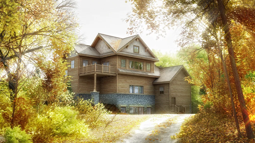
Fall Inspiration
Fall, my favorite time of the year!. I was inspired by all the Fall colors so, here is my latest 3D Architectural rendering, with some Fall inspiration.
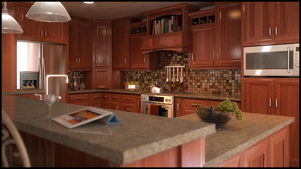
Composition is one of the Most Misunderstood Concepts
Composition is one of the most misunderstood concepts, in any form of artwork, It has been said that you can be the greatest illustrator in the world, but if you don't know how to compose properly, your 3D Architectural Renderings will fall apart. I have seen hundreds, if not thousands, of 3D Architectural Renderings. I always ask myself, " what makes this 3D Architectural Rendering better than most". My answer is always that the 3D Architectural Rendering has a strong composition and is well-designed. In this, my 3D Architectural Rendering Blog, I explore the different aspects of composition, the principles of good design, the effective use of "eye stoppers", the proper use of negative space, and how to locate the center of interest correctly. Composition is really about moving the viewer's eye. The challenge is to arrange all of the components of the composition so it's a pleasure for the viewer to look at your 3D Architectural Rendering.